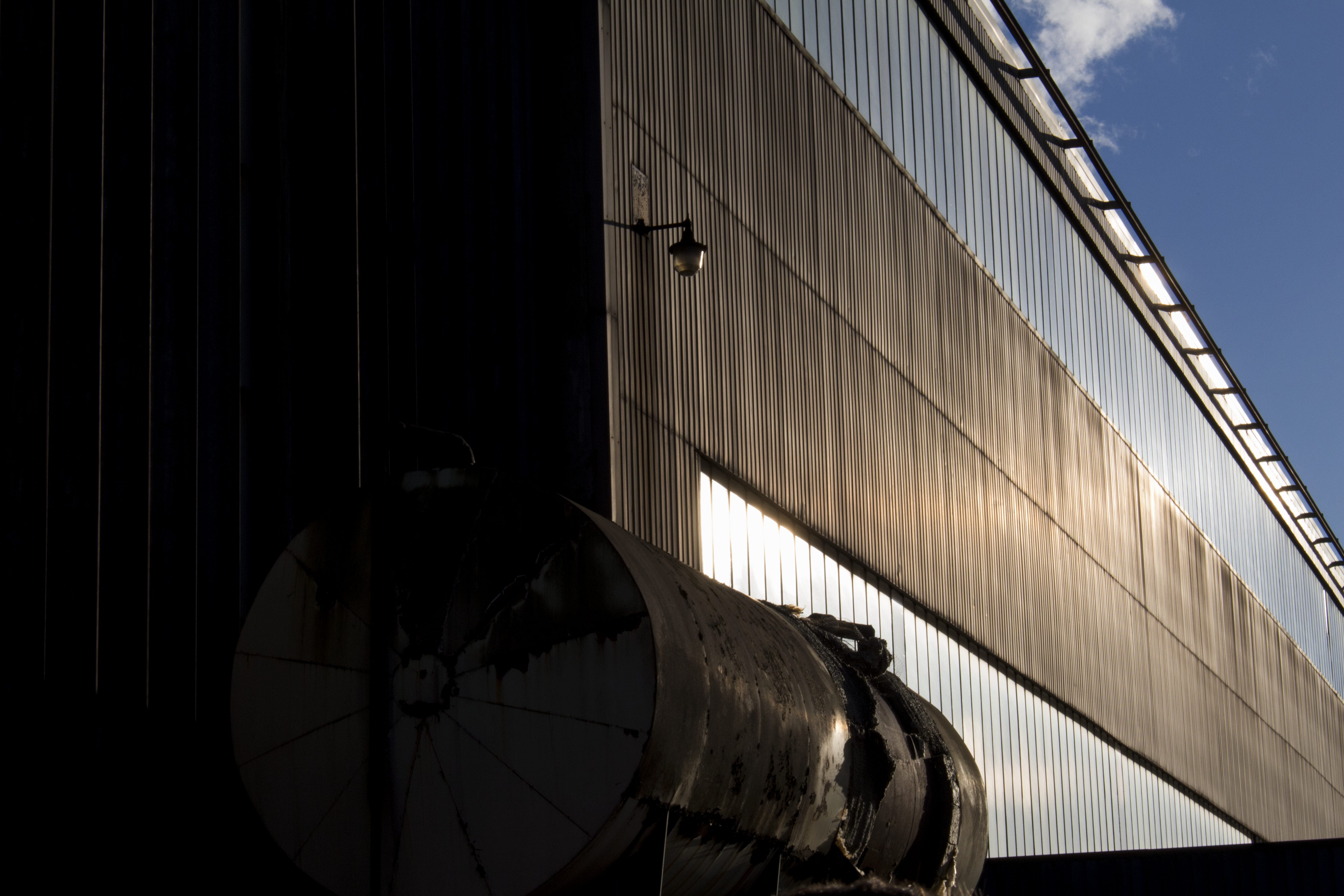
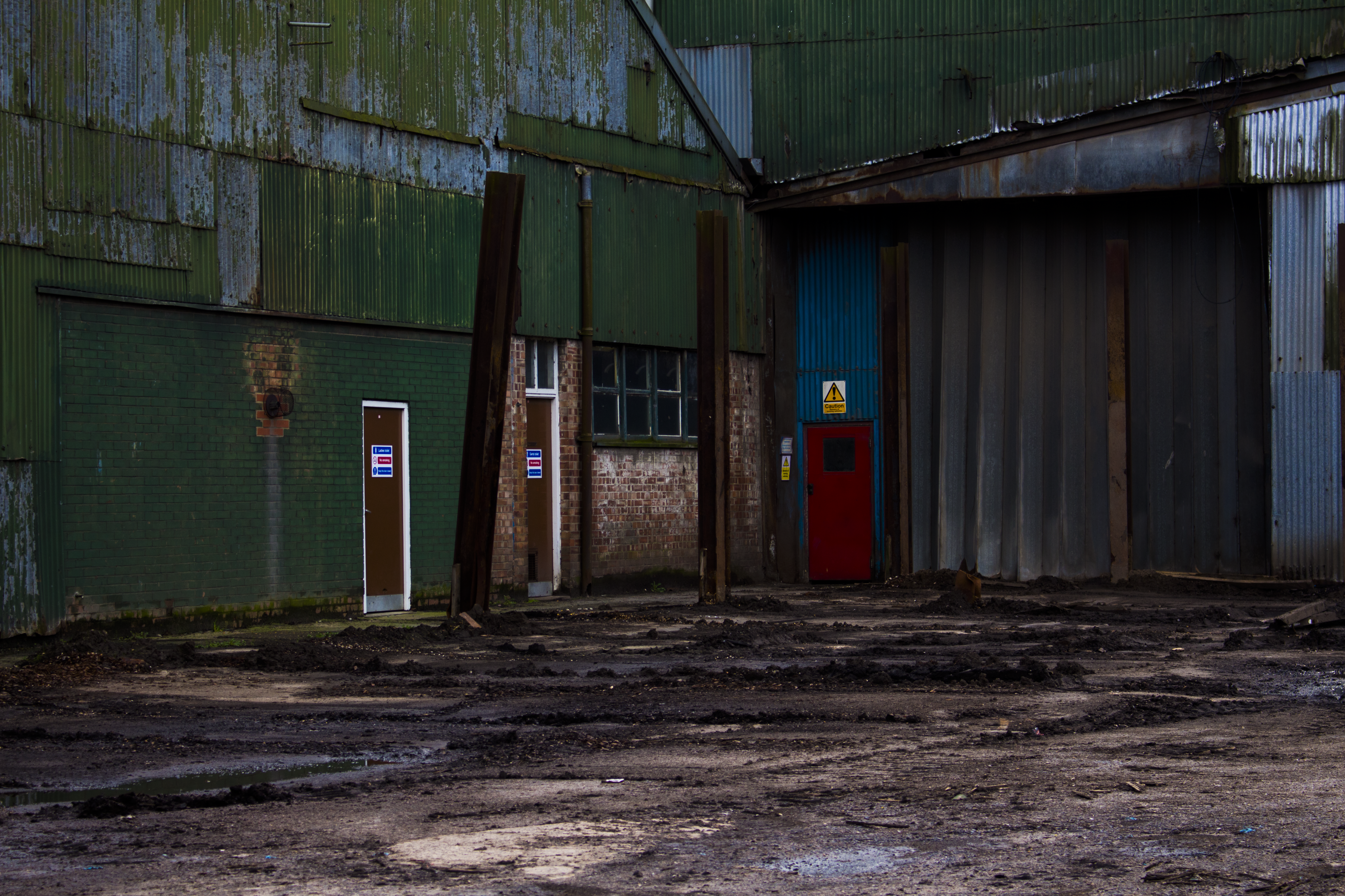
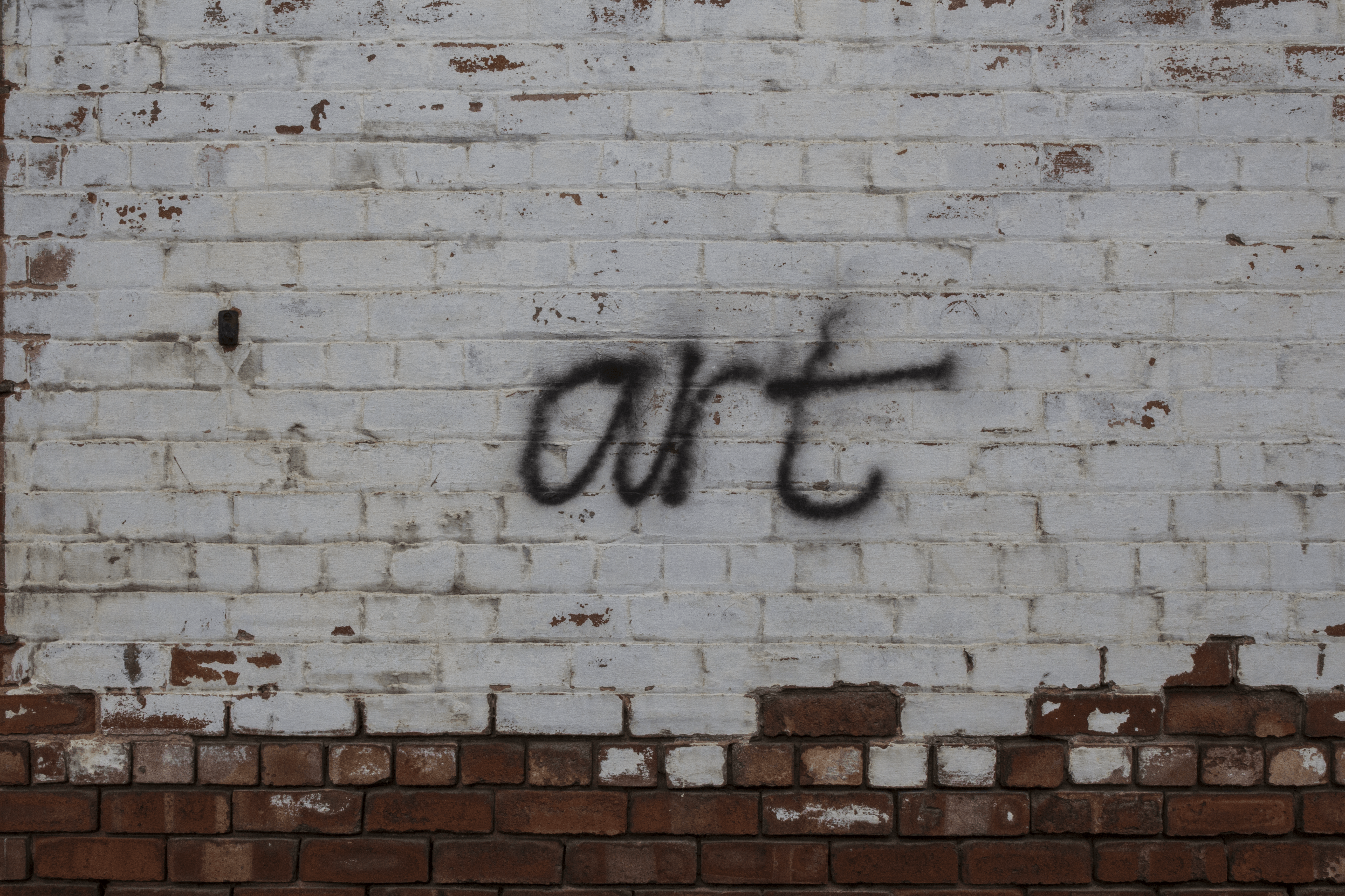
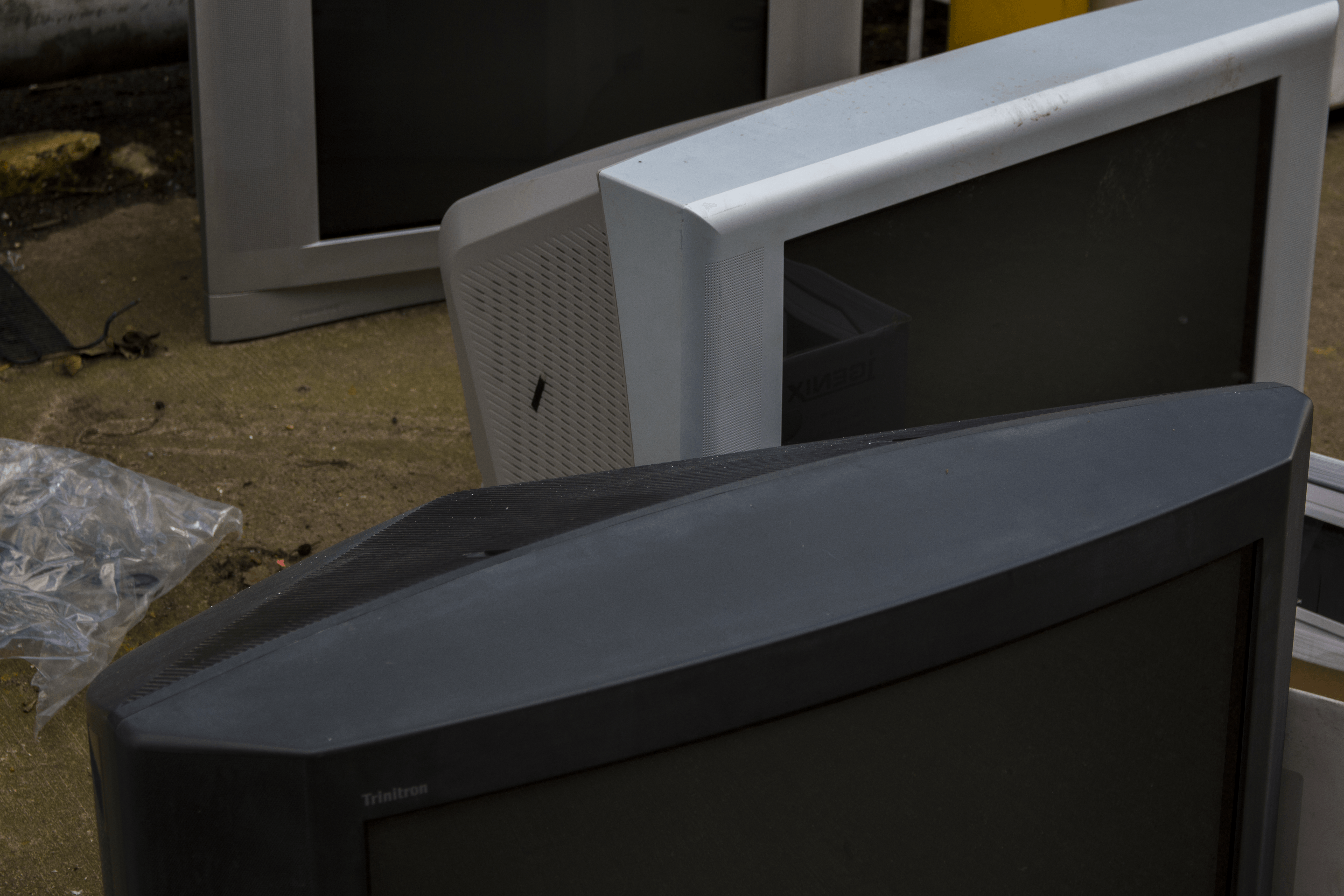
This is one of my favourite images from this page. I used the movement and shape of the building to create this neat, liner effect running down the light side which I believe then contrasts nicely with the shadowed side of the building. The destroyed barrel also shows the separation between the two.The colours red and blue are very dominant in this picture, even though there is very little of it. Because they are slightly centred the attention is drawn towards them, with the colours surrounding it there is a sense of abandonment within the image, this is also obvious due to the fact that this warehouse is probably abandoned.I like the sense of irony within this picture. With the word ‘art’ gratified onto a dirty wall to me it defects the whole purpose of it trying to be art. But by taking a picture and purposely making the graffiti the central subject it gives it something more.To me there is a sense of movement within this image, this is from the three televisions positioned from top to bottom of the frame all showing a different part of the television.There is a nice contrast between the red and blue within this image, however it could be improved with the three red pipes. Instead of the outside ones moving in towards the centre they should all have been moving down in a straight movement.Again in this image is there is a sense of movement from the building starting from the top left and going downwards to the right. The colour of the blue sky and foliage at the bottom show how cold it is within the image.
Leave a comment